
Debbie Clarke Art. "It's AHHT! or not."
Tuesday, April 13, 2010
Outdoor Painting and Drawing Classes with a real Glosta' artist
View Larger Map
Outdoor painting and drawing classes (weather permitting) with Debbie Clarke begin Sunday April 18, 7-9am. Classes meet at the Cripple Cove Parking Lot across from Zeke's. arrive by 6:30 to set-up. fee $25. all levels encouraged from newbies to pros to register contact me via email: elli01930@yahoo.com
all painting and drawing media welcome, sorry, no watercolor.
questions, etc, you know what to do.
best,
deb.
Sunday, April 11, 2010
Domenic Cretara Part 2
Domenic was my painting teacher at The Art Institute of Boston. I think he is at UC Davis now. Seeing his work takes me back to the dirty, drafty, studio we worked in. The students were cold, and the models were freezing. A lot of my work from those years include the orange glow of the space heater reflected on the model's flesh.
Today I retrieved more of my old work from storage. There are a few paintings left from art school, a few drawings. I continue to weed out my work, or as my daughter reminds me: "Mom, you have one hell of a portfolio." she has no idea how much work I have lost track of and thrown away. Well, maybe she does, as she continues to build her 'life inventory' of artwork.
best,
deb.
Favorite Place

This arrived in the mail a few months ago. It was scanned and placed on this blog, then it was forgotten. It reappeared, found amongst my journals, a few days ago. I thought it was a decal, basically useless to me, as I do not have a storefront studio. Turns out, the front is the same as the back and one side is sticky. I stuck in on the door of the Dakota. I find humor in this, as my pick-up truck is not exactly a sociable looking place for a favorite place to be. If someone with an iphone, or other device with the favorite place application on it, that little square can be scanned. It will open my google business center listing, with my blog info and one can jump to google map, Voila! studio hours: by appointment only. Drawing class schedule will be up within the week. I'm going to look at a studio space today to find out about evening classes (figure drawing). Outdoor classes will be 7-9 on Sunday mornings. location to be determined.
You Too can be a Favorite Place, get your business on the MAP!
Debbie Clarke Art place holder on google business center
best,
deb.
Friday, April 9, 2010
I''m a twit, tweeting on twitter!
and the name is debclarkeglosta. how many names do i need? apparently many. debbie clarke, deb clarke, pbsage (paintbrush sage), another magpie, debclarkeart, elli01930, deb01930....webbie was my first nickname. given to me my by my babysister linda. i called her sister until helen said (i was 3, mike had been born) her name is Linda. Linda!
i find my preponderance to refer to my daughter's father as eb's father, my sisters as sisters, my boys as my boys and a reluctance to name them goes to my choctaw roots.
my grandfather was your father's father. my uncle your father's brother. my mother, your fathers wife...and gradually nana introduced georgies father, georgies wife...all buried in the traditions of my grandmother's (my father's mother) roots.
if i were danish i would prounounce my father as fart, my father's father as fart fart, my father's mother as fartmor, my father's father as fartfart and my mother's mother as mortmor and my mother's father as morfart.
say that 10 times fast in the right order.
and in a good world my mothers brothers would have cared for me and my fartmores brothers would have cared for my fartmores sons, but then, i may have never been.
i digress.
best,
debbie, aka deb, pbsage, another magpie, etc.
Thursday, April 8, 2010
Hero
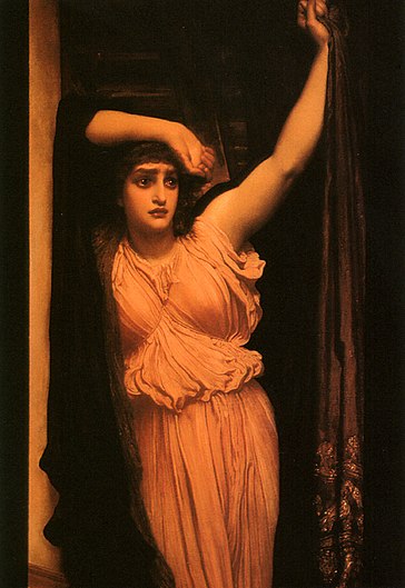
A reader of the blog sent a link to Fredrick Leighton's painting of Hero. the wikipedia link the tale follows.
Hero and Leander.
Thank you John for the link!
best,
deb.
Refrigerator Magnets, again!

These nifty refrigerator magnet clips are promo samples from my friend Brenda at TipTop Branding! a handy calculator, and it works! A night light magnet clip highlights the words "Life Refrigerator". These bios through the surface of our refrigerator doors are instigated by my good life friend Chan Buck. She posts regular 1 minute video bios on facebook. One of her bios is titled "Life bio" and the story unfolds through the items held to her refrigerator door. I have a lot of stuff on the big black refrigerator box in my kitchen. When I first saw it my thought was ugh! Then I quickly recognized the advantage of a black backdrop for colorful stuff, and it works really well as a blackfield to play my artwork against.
you can get your brand name on these nifty items by contacting my friend Brenda Treuhaft at TipTop Branding. following is the company link, click the tab for company, go to our team and you will find Brenda's smiling face and contact. when you talk with Brenda, tell her Debbie sent you.
Tip Top Branding
Tip Top Branding
best,
deb
send me pics &/or videos of what's on your fridge and I will be sure to post it here!
post link here, or send to me at elli01930@yahoo.com
Wednesday, April 7, 2010
Refrigerator Magnets!

CapeAnnPainter Paul Frontiero watched the refrigerator bio and discovered I love refrigerator magnet clips! He stopped by Bananas recently and gifted me a colorful collection of clips! Thank you Paul! 2 of the clips are holding the glad news of Caleb's arrival into the world and my art buddy Howard Kline's inspirational cards! in Greek mythology Hero is a priestess of Aphrodite beloved by Leander.
you will find Paul's blog with artwork here
you will find Howard's artwork here
best,
deb.
Tuesday, April 6, 2010
"This is Karen" a drawing for an artist in training

This is Karen, the completed work documented in my earlier 'wip' in the series "Faces I Remember". It is finished. During the process that brought the work to this point I was continually critiquing the work. I kept trying to get the eyes above the one third, but my inclination was to keep cutting the 'shape' down. This morning I finally decided to find the center of my canvas. Wouldn't you know it? French painter Pierre Bonnard's words critiqued the work, he said: "There should be nothing in the center of a painting." Then portrait artist Helen Van Wyck words critiqued the work: "In a portrait the eyes should be around the one third point." then I said: The Hell you say! I'm still in training! This is Karen and this is the way I do it. I broke the rules, yet it works. why? because it is didactic and self referential.
so, there.
"This is Karen" a training drawing
copyright debbie clarke
gloucester ma 2010
mixed media on canvas 12x16"
$275 including shipping, no frame
cash or money order only.
US continental sales only.
3-4 weeks for delivery.
Art Criticism
This link will take you to Steve Aishman's Report at The Phantom Zone on Big Red and Shiny provides some excellent guidance to writing art criticism, as well as, how artist critics write critiques.
"Get ready for someone to hate you and try to keep your philosophy down by yelling louder."
The Big Red has deleted their links section. bummer, peeps came to read here from there, and i used to go through the links from time-to-time. I still check in, but really miss the links.
best,
deb
as always questions, comments, critiques always welcomed here or to: elli01930 at yahoo.com
Saturday, April 3, 2010
The Self Portrait

I will start teaching again soon. Whether folk show up with paint, canvas or rag, they will learn to draw. Drawing is not passive, it is an active verb. When we draw we are training our hand to follow our eye, and under the direction of an instructor, we learn how to move the eye. We learn first 'how to see' spatial relationships and this process of looking, teaches the hand 'to follow'. (eventually one may get to Joan Mitchell's 'no hands', but that comes much later, maybe years.) The first lesson for all of my students is the head, through the observation of the self. The 'self portrait'.
to paraphrase leonardo 'the face we love the most is our own and we tend to impose our features on the other.' to this i add, first we see our face in the other, and then as artists, we learn to see how unlike ourselves the other is. when all the brouhaha came out a few years back about The Mona Lisa being a self portrait of Leonardo I cracked up. Knowing some of his thought, I was not surprised that they were able to find the leonardo's self portrait in the Mona Lisa's face.
I have not drawn an observational self portrait in quite a while. To draw one is the quickest way I know of to get back into my drawing/teaching mind. It is an opportunity for me to once again look at myself with no words and make sure my skills are still sharp.
I took a photo self portrait today to document what I look like to the camera. I will start the drawing later tonight. the progress will be documented.
best,
deb
comments, responses, questions, critiques always welcomed. either here or email to elli01930@yahoo.com
Tuesday, March 30, 2010
Domenic Cretara Documentary part 1 of 3
this is the guy that taught me figure painting when i was at The Art Institute. it is good to hear his voice, i can hear my voice as a teacher through some of his words. and i was directed to this video via a long lost friend's recent visit to this blog in search of information on another teacher's teacher George Demetrios. to paraphrase Audrey Flack: ' one of the things about artists is we honor our teachers.' more about Domenic later, there are a lot of video demos by him that i have got see.
The WIP: Faces I Remember
two pics, same work. top with white balance, bottom with automatic setting


My friend Paul Frontiero aka Capeannpainter recently posted about taking pictures of his artwork. His issue is the photos lean towards blue. One of his readers suggested he use the white balance feature. I have never tried the white balance, so I did. My simple $100 kodak digital has a white balance with three simple settings: daylight, florescent, tungsten. I used the daylight setting, with close-up. The white balance worked! the top pic reads true. I also tweeked the contrast a bit to get the pic closer to the drawing.
media for this face with no name (for now) is gesso, conte crayon and aluminum leaf on canvas, 14x16". The composition is simply two shapes that i am in the process of complicating. I use this same composition to start landscapes, standing figures, still life. I have accumulated quite an inventory of these faces during the past three years. some with names, some without. This one has been on the drawing table for 3 weeks, and may or may not be done.
click the pics for close-ups.
best,
deb.
Wednesday, March 24, 2010
Our 'Fridge
Kenny MacCarthy's refrigerator bio! YAY! this is response # 2. so, what's on your fridge?
Tuesday, March 23, 2010
Refrigerator Bio 2
continuing the idea of a refrigerator bio, inspired by my friend Chan's 'life bio'. i've tried to incorporate fred's constructive criticism: hold the camera still, add more light. critique/comments are welcomed! i would love to see what's on your fridge, if you care to share. best, deb
Monday, March 22, 2010
Refrigerator Bio (kinda) For Deb Clarke
Hey! Joey at goodmorninggloucester.com posted a response to my challenge to folk to show off their fridge bios! this video is up on his blog today. I want to know: Where can I get some Guy Cottens? I need rain gear.
Art Criticism
"Let the wise artist invite criticism and survive it when it comes."
Eric Maisel
I first picked up a paintbrush when I was 10 years old and decided to fix the clouds in my father's painting. I was so careful to mix the right color, to extend/soften the edges just so. After the work was done, the brushes were cleaned, then carefully placed where they were found next to his palette. George (my father) knew right away, then turned on me. His anger at my 'destruction' of his work, was the first criticism of my 'art' and it was not kind.
Criticism can be a scarey thing for an artist to take, yet this is the way we learn our trade, our craft. Following is a list of critical responses to my work, and some of my responses:
1. Who did this? from my father when I was 10. then from my 8th grade art teacher Mr. Lillie. terrified I raised my hand. He just looked at me, gave me more paper, and made sure I had plenty of charcoal. This happened again in art school when I presented my slides for a final portfolio. The old terror of George's first critique, always my first response, I prepared myself for the 'slap'. Instead Henry Altmann praised my efficient use of the brush to draw with the light.
2. Where's the edge of the form? Here? or Here? or Here? This from John, an art school boyfriend in response to my figure drawing. My first response, disappointment, fear of loss of love, just because I didn't 'see' as he saw. His critique was later echoed by Peter Hoss, my art school drawing teacher, when he asked me if I was looking at Giacometti's drawings. yes, I was trying to incorporate Giacometti's use of line into my work. Peter kept poking his finger at my drawing: is it here, or here or here? Don't just copy Giacometti, understand his seeing. That's when the lightbulb went off. The 'edge', the 'line' wasn't anywhere out there, it only existed on my page. That's when I fell in love with the line, and came to understand that everything exists in space, infused with light and my drawing 'style', this use of line was simply my experience of 'looking'.
3. Tell us about your work. This from my final portfolio review at The Art Institute of Boston. I critiqued my work with all of the negatives. I had a concentration of still life charcoal drawings that were black and smudgey, and I was trying to combine a strong abstraction with figuration. I was feeling as if I had failed in my attempt. "But that is WHAT YOU ARE DOING!" was the resounding chorus. I cried. My sculpture review was abysmal: everything happens on the surface. Today, almost 40 years later I do 'flat sculptures' through my use of glass and metal leaf, they walk a line between figuration and abstraction.
4. Don't hold your brush in your mouth!
5. Don't point your brush up with your mouth!
6. Why are you starting over? Who said you can't use an eraser?
7. Use a mask when you sand your paintings!
8. Don't wear your good clothes when you paint!
9. You never finish your work. Why don't you finish your paintings? They are finished. They 'don't' look finished. and this is one of the cornerstones of my work: to leave the work as if i have just stepped away and could pick the brush up again to 'finish'. I like this tension, and the introduction of a sense of being 'in the moment' of creating. the most frequent critic of this 'not finishing' was my father George. The last time he saw my work we were looking at a 7 foot standing self portrait that took me a year to do. the first comment by me to him was "I know it looks unfinished, but I like it this way." George said: "I do too." and we stood in silence looking at my work for one of those 'timeless' moments. was it a minute or an hour?
10. Just a few days ago an artist friend said: I've been looking at your video demonstrations on youtube. What bothers me is the Sharpie. I laughed and said: The erased sharpie? she said no, leaving the sharpie, it is not permanent. I smiled and said: oh, that. it doesn't bother me. if the sharpie pigment detaches, so what? I don't care if it is permanent. (is anything ever permanent? no. truly, truly archival? no. why? time. change. impermanence says the buddha). My artist friend thought for awhile then said: Well, at least I learned how to put metal on glass. Then she got up and abruptly left.
I have been painting for 46 years. I can paint and draw anyway I want. i give myself this permission, with no apology. I can leave things, tear things up, show them, not show them, give them away, throw them away. It doesn't matter. All that matters is that I have a practice of seeing, experiencing, transcribing and making art. It is what I do. a few good well timed criticisms have helped me along the way to live a life of art.

if you are a practicing artist may you know what criticism to receive, may they be well timed and may you be honest in your 'seeing' and kind in the giving of your critique.
best,
deb.
"Stand" oil on linen, copyright debbie clarke, gloucester ma, a self portrait
Saturday, March 20, 2010
Paul's addendum to my dangerous coffee cup
http://goodmorninggloucester.wordpress.com/
Goodmorninggloucester is one of the best community blogs around. There's a lot of fun and local color going on over there. and my friend Paul (capeannpainter) loves to 'horse' around. Check it out and if it suits your fancy, follow. I read it every day and sometimes several times a day.
best and happy Spring!
deb.
Tuesday, March 16, 2010
danger Will Robinson! Danger!

Sunday, March 14, 2010
Leap Forward: a refrigerator bio
Our refrigerators tell a lot about us. Here's what I'm willing to share for now. you can be assured there will be more!
Monday, March 8, 2010
Hey, I'm #12 in the Ukraine, and get noticed in Weimar. Very Good.
Check your Geoblogosphere ranking
NOTE: You must have Feedjit's Live Traffic Feed installed on your blog or website to be listed in the Geoblogosphere. You must not be an adult website and your site can not be web spam or contain any malware.
http://feedjit.com/myRank/
Enter your site hostname or URL below and hit "Check" to see where you rank in the Geoblogosphere. We also check if your site has been listed as spam, adult, containing malware or if you have been listed as a dangerous site with Google or any other companies.
You Rank #12 in: Ternopil', Ukraine
You Rank #478 in: Weimar, Germany
You Rank #804 in: Kalida, United States
Note: We analyze the cities that have sent you the most traffic recently. You may rank in many other cities in the Geoblogosphere.
they like my chair video thoughts.
Sunday, March 7, 2010
How to Paint A Chair, a work in progress, thoughts on painting and Big Images!

click the image for a REALLY BIG image!
"Art is really a battlefield. Only when he no longer knows what he is doing, does the painter do good things."
Edgar Degas, French Impressionist
and some music that I want for my studio archive: Sade. have always loved her work, and 'soldiers of art' are 'soldiers of love', in that if you are called to make art, you will make art for a very demanding mistress. a lover that will have no one between, that will wake you when you want sleep, that will delay you when you have appointments, that will make you not feel 'well' when you are not dancing with the muse. and muse seems too nice a word. dancing with a muse is neither romantic nor poetic. it is a hungry ghost in need of a door into this realm of reality. and when she truly decides to dance with, then through you, it is better than an orgasm.
the muse doesn't dance every day, she is fickle in her love, and never obediant. i spend most of my days in the practice of seeing and drawing, so my hands, eyes, and heart are ready, whenever she decides to come, because that is her nature.
Tuesday, March 2, 2010
How to Draw, a figure drawing on aluminum

copyright debbie clarke 2010
gloucester ma
marker, aluminum and silver leaf on shaped/incised aluminum flashing
Monday, March 1, 2010
How to Draw on Aluminum flashing
"How to Draw" a dip completed
copyright Debbie Clarke 2010
Gloucester MA
aluminum drawing
5x5"
$125.
Monday: Metal Incised Torso, a dip (drawing in progress)

molded, incised aluminum panel
5x5"
gilded with aluminum and 925 silver leaf
copyright debbie clarke 2010
gloudester ma
Saturday, February 27, 2010
a journal entry from a long time ago, a haunting, of sorts.
oh ...
rot. that's what i heard everytime i stood in the west studio. i had to cross to get supplies. then i forgot the razor blades, then the alcohol, back and forth, open the window. back and forth and suddenly 'rot' pops into my head. as if someone were saying 'oh rot.'. it is an old persons voice. smells musky. straggly hair, greased with sweat on top. three teeth show, the rest rotted stumps. 'rot'
smudged the space and rot settled down.
the studio air seemed to be milky today. as if the fog had seeped inside. it seemed to swirl and settle as i moved through. i thought they might have burned meat in the blackburn. lakshmi didn't smell burnt meat. she smelled incense. it sounded like there were folks upstairs (there is no upstairs). heard some men talking and doors opening and closing. there are more folks in the building; however these sounds were 'in' and 'of' my studio space. there are a lot of them.
may 2001
best,
deb
ps: there were also echoes of children playing in the building, chasing balls, and the voices would trail off.
ghosts an over active imagination. i don't know. but the milky air settled back into the space the day i left there for good. i smudged to cleanse, and i 'saw' it roll back in and settle.
Wednesday, February 24, 2010
Wednesday "W" today a wip (work in progress) completed
Goodmornin', a drawing
aluminum leaf, sharpie marker, litho crayon on aluminum flashing 5x5"
Copyright debbie clarke
gloucester ma
2010
this is a self portrait from the computer screens point of view. yup, coffee in one hand, finger on the mouse, and everything hasn't quite settled into place.
Tuesday, February 23, 2010
Tuesday Twos
Two Things:
1.
2 recent visitors to the nest arrived here from a google search for "Flounder Ally". an ally? or alley? I looked for Flounder Alley and discovered it was at the intersection of Broad Street and Atlantic Avenue in Boston. long gone alley, gone to urban renewal, fill, expressway. have not been able to find it on a map, but found references to peeps that dwelled there. I worked at 89 Broad Street back in the late seventies/early eighties. Norm and I once shared a conversation about Boston Harbor. we were talking about risk management. he told me a story about his fears and lng tankers, and today the Yemeni Tanker made port in Boston. and I saw the the profile of the lng terminal under construction, 3 miles out, as i crossed our Stacey Boulevard today.
2.
a big shoutout to Captain Joey and friends at Goodmorninggloucter! coming up on a million hits! Way to Go! http://www.goodmorninggloucester.wordpress.com/. the brainchild of neighbor Capt Joey of Captain Joe's Lobster. He has created a terrific community resource that i am so pleased to be a part of.
best,
deb.
Monday, February 22, 2010
Monday's Marketing resource
Mondays will be a day for the mailbag postings, and/or marketing adventures for this artist. and todays great new resource, soon to appear in this blog: Pages! yup, static stand alones, and that's what i'm gonna do. soon. right now, house cleaning. windows open, the air is clear and fresh, with a hint of spring on the backside.
best,
deb.
oh, here's the link for my future ref on how to.
blogger buzz: create pages
best,
deb.
oh, here's the link for my future ref on how to.
blogger buzz: create pages
Sunday, February 21, 2010
Seurat Drawings

I always remembered Seurat drawings as being litho crayon on paper. I was wrong! He preferred conte crayon with some mixed media from time to time. They have the 'feel' of a litho crayon drawing. I think I will do a conte drawing and a litho drawing this week to compare the two media.
The drawing is Seurat's "Pierrot and Columbine".
Miscellaneous Notes: Recipe for making Litho Crayons
A recent guest of the nest arrived from a google search for a litho crayon recipe, one of my drawing tags is litho crayon, that's the link to the search result. I thought the inquiry interesting enough to track down a recipe for making litho crayons. My first handy reference, always in my studio at hand, is Ralph Mayer's 'handbook'. The handbook is well indexed with 5 references for litho crayon under lithography. There are numerous recipes under miscellaneous notes page 580-582 (fifth edition) for the making of litho crayons. the basic ingredients are wax, soap, lamp black. the recipe need not be exact. the instructions are straight forward with excellent information about the properties of each ingredient.
I'm not a lithographer. I use the crayons for drawing on paper and glass. William Korn's litho crayons meet all of my needs, and they are graded. i prefer #3 and #4.
I'm not a lithographer. I use the crayons for drawing on paper and glass. William Korn's litho crayons meet all of my needs, and they are graded. i prefer #3 and #4.
Saturday, February 20, 2010
Blog Catalog
http://www.blogcatalog.com/blogs/another-magpie-nest.html
This link will take you to my page on blogcatalog. I signed up there a few weeks back, and forgot to go back to poke around. The page looks great! I signed up because the blogcatalog newsletter is full of brilliant tips of use to bloggers, those wishing to establish a web presence, video blogs and all kinds of useful stuff for likeminded folk. With no participation on my part, other than just signing up I have gotten several visitors and return visitors from my listing. I like their page set-up of my blog better than mine! and it is free!
I am impressed and I am going to go back and poke around.
oh, well. poked around to find the social twits were sketchy and lots of beautiful girl updates. too bad. guess i just won't go to that part of the site.
best,
deb.
ps: i will leave my site link there. i like the look and feel.
next focus for this webbed citizen: put prices on my work..
Rembrandt Yellow!

oil on panel
copyright clarke 2010
gloucester ma
no iinspiration? no such thing. art is 99% persperation, 1% inspiration. and when i don't have a lot of available time, no major 'projects' going on, i play around. and in these palette paintings i accomplish two things: i get to paint, and discover a bit about my medium.
Friday, February 19, 2010
Artist Studio Space

I've been looking around to see what the town has to offer for studio space. this is the courtyard side of the Blackburn Building at the corner of Maine & Washington Streets. I looked at 3 space. a room with no windows, but close to facilities. a penthouse with great western light, a fireplace, close to facilities. a large room in the extension without facilities, but one can go downstairs, outside, take the elevator and facilities are available. rock bottom prices: $250 - $800. no thank you. i used to have a the 4th floor northwest corner of this building. i moved out because of ghosts and the smell of burnt meat. oh, the racoons also made the roof outside my window into their mess.
next.
Pthalo!

copyright clarke 2010
gloucester ma
oil on panel with litho crayon
pthalo is an amazing pigment, it can be found in paints with hues ranging from yellowish green, to rose, to green, to the darkest blue. one of my favorites, but it creeps on the palette, and if one is not careful it will get into every mix. good practices and lots of rag for a clean brush helps!
Tuesday, February 16, 2010
Suggested palette set-up for oil painting
I will be posting a palette set-up with pic over the next few days in response to a question from Paul (capeannpainter) here's my color line-up:
2 yellows: one light and bright, one dark. my choices: cad yellow light, cad medium, yellow ochre, raw or burnt umber
2 reds: one light and bright, one dark. choices: cad red light, grumbacher red, alizarin crimson
2 blues: one light and bright, one dark. choices: cobalt blue, pthalo blue. i rarely use ultramarine except to mix a violet.
other colors: burnt sienna: the only dark orange there is.
green: pthalo green and viridian. i only use these when i can't mix the color from the above blue/yellow choices.
titanium white, original formula pre-test (grumbacher)
black: ivory for a cool palette, mars black for a warm palette. i rarely use black, but it has its place.
when i start i determine my palette by what is before me.
best,
deb.
and once again, everything you might want to know about, mixing and a bit more, I recommend Helen Van Wyck's Color Recipes. you can click through to Amazon.com via this link and i will get a few pennies should you order, or order your book through your local booksellar. My local bookstore is The Bookstore on Main Street in Gloucester MA, tell them Debbie sent you.
Monday, February 15, 2010
The way through the Blue Madonna: an iconographer's beginning

The Blue Madonna: a glass icon
circa 1995, written through me.
My interest in the use of gold leaf goes back to a contemporary fresco 'fragment' that i saw in a Boston show. don't remember the gallery, don't remember the artist, but i remember the light of the gold. I used gold decoratively on paper and driftwood , then abandoned it. years later i discovered Peruvian Imports verre eglomise hand mirrors, trays and household accessories. This ignited a desire to combine my love of reverse glass painting with metal leaf. This is one of my first attempts, loosely based on a fascination with the "Black Madonna". The black madonna is an icon that deepens with age, eventually turning 'black'. some of the discoloration towards black may be the inherent nature of the pigments to change over time, the presence of silver may cause a darkening, and the accumulation of soot from the candles used to illuminate the madonna.
in theological terms an icon is a prayer written through paint and color. the iconographer listens with an inner ear and in cooperation with the holy spirit 'writes' the image. all colors have theological meaning. god calls the iconographer, and all one needs to do to become an iconographer is to copy another icon, the spirit will direct the work.
in this Blue Madonna, i answered a call, but did not know the way. since this beginning i have gone on to study and teach the way of the icon through workshops offered through my art studio.
as always,
this work is offered up for the comfort of the people.
if you are interested in learning more about glass icon painting, here is an excellent youtube link to the master Byzantine glass iconographers.
questions/comments welcomed by leaving a note here or email to: elli01930@yahoo.com
From the Mailbag
A few years ago I was playing around with some video clips made with my $100 kodak camera. Windows Movie Maker couldn't produce the video due to resolution/light issues, so I downloaded a trial home movie maker with a pre-loaded, wacky video editor. The video I produced gives directions for making egg glue, also known as glair, which is a glue that can be used to adhere gold leaf to a panel. Last week I received some good questions from Scott Songfeather, a self-taught iconographer:
following are his questions and my response:
"Researching verre eglomise I was pleased to discover the vids of you at work with the technique and your blog.
1. Is the ratio of snow/crushed ice to the egg white critical? How much snow to egg white is good?
answer: the ratio isn't critical. I use about 2 tablespoons of snow/crushed ice.
2. Should the egg glue be used immediately, while still cold from the snow/ice?
answer: the glue sets up to tack pretty quickly and can be used immediately, but it is better to let it sit refrigerated for 24 hours. the albumen coagulate (chelaga) and other residue should be strained out to create a glue that will flow smoothly onto the surface to be gilded.
3. Is snow/ice necessary, or will water substitute satisfactorily?
answer: Ralph Mayer in "The Artist's Handbook" has a recipe using 1-2 tablespoons of water. I have never used this recipe, so I don't know the results. If Ralph says it works, it will work.
I paint icons in egg tempera and recently discovered online the Romanian technique of icon painting reversed on glass (verre eglomise/hinterglasmalerie) and plan to try it. Thus these questions.
Thanks, and best wishes,
Scott Songfeather
Scott provides some excellent pics and directions for writing icons under the username Celadonite on wet canvas. follow this link for his info.
If you have a question/comment that you would like to see answered through this blog, you can leave a comment here or email me at elli01930@yahoo.com
best,
deb
Wednesday, February 10, 2010
The Plan B Fishing Vessel
Thanks to capeannpainter Paul Frontiero for this link showing how the sein boat gets loaded onto the Plan B. awesome.
Saturday, February 6, 2010
Studio Library: Hawthorne on Painting
This is a collection of critiques given by Charles Hawthorne to his students in Provincetown. The criticques were gathered by Mrs. Charles Hawthorne. Small, simple concise. One spot of color against another spot of color. One shape against another. Don't worry about the drawing. One correct size, shape and color against another and another creates a painting.
Whether you want to learn to paint or just understand how painters "see"; this is a must. a constant painter's companion and recommendation to all of my painting students.
Once again you can click through here to Amazon to purchase, and I will get a few pennies for your efforts. or, Order from your local booksellar. My local bookstore is The Bookstore on Main Street in Gloucester. There is a clickable link in my sidebar. Tell them Debbie sent you.
Friday, February 5, 2010
Art and Ready Made
This is the image from designer's daily. The article can be found on the following link. This fly is embossed on the urinals in Schipol Airport in Amsterdam, it is the logo for a porcelein urinal manufacturor (need company name). Guys aim for the fly! it cuts down on spillage with a sweetened environment, with a lot less slippage for the guys. I wonder if they use down the wharf at Capt Joeys.
http://www.designer-daily.com/things-that-the-little-fly-in-urinals-can-teach-you-about-design-782
and if you want to buy a decal: a 10 pack is $9.99!
the link to that is here: http://www.urinalfly.com/products.aspx
Local Colors coop members used to have lengthy discussions about what is original art, and what kind of art did we not want. A photolithographer applied. The subject cars. there were lithos, posters, cards, very commercial, very marketable, but did not seem to fit in with our idea of original art. but, what did we mean. a group agreed to meet to come up with a definition for what we meant by 'original art': thorpe feidt, ashley thompson, debbie clarke, jay mcglaughlin, sue anne? mollie? rebecca? we met one night a week (or was it one night a month?) to discuss the thorney issue.
we ended with this:
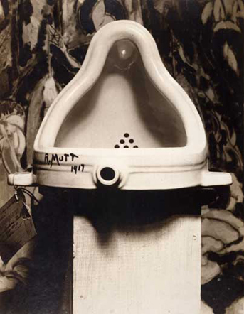
Marcel Duchamp's "Readymade" signed R. Mutt. We could not not give a concise definition of original art, but we all agreed this urinal is art. however, selling pics of it, is not art. a pictorial such is this is part of our trade goods: commercial, not for sale, for give aways. unless you become famous, then museums etc, get to sell pics of the famous work and make a profit, and the original becomes even more famous. so, we were not going to allow the sale of photo cards of the work, unless somehow manipulated by the artist's hand into a 'new' original art.
I hear Audrey Flack in "Art and Soul": to paraphrase, art is a new thing added to the universe, something that did not exist before in its present form.
click my amazon link to purchase the book and i will get a few pennies for your efforts. or you can order from your local bookseller, my local bookstore is The Bookstore. a clickable link to The Bookstore is in my other places list. tell them debbie sent you.
Tuesday, February 2, 2010
The wip (work-in-progress): Paul Frontiero continued. or how i got from there to here


Paul Frontiero, continued verre eglomise demo as seen on the goodmorninggloucester.com demonstration videos. from top to bottom: the canvas backing is overed in aluminum leaf that is adhered to the damp gesso. 2) the glass panel placed on top of the gilded canvas before the glass is scraped. 3 and 4 are details of the head with the aluminum leaf showing through. 5) toning the aluminum leaf with the darkest orange: burnt sienna 6) the current state of this work in progress. Today I will make some gelatin slurry and place some mirrored shapes. pics to follow. Paul is aka the Cape Ann Painter here's a link to his blog. http://www.frontierogallery.com/
Monday, February 1, 2010
Debbie Clarke Verre Eglomise Demonstration Video Part III
Capt Joey did this a week ago Sunday. it is on the www.goodmorninggloucester.com site.
Sunday, January 31, 2010
Tuesday, January 26, 2010
Debbie Clarke Verre Eglomise Demonstration Video Part I
Capt Joey's video of my demonstration as seen on www.goodmorninggloucester.com
Sunday, January 24, 2010
Saatchi Showdown 25 january 2010 through1 February 2010
http://www.saatchi-gallery.co.uk/showdown/index.php?showpic=252814
Click for the direct link to my Saatchi Showdown Entry. Saatchi Showdown is where artists place their work (one piece only) against other artists work. The public rates the work by clicking stars (1=lowest, 10=highest). athe the end of the round, the two artworks with the highest average rating go head-to-head and advance.
This is my second submission to the Showdown. In the last showdown i got a bit over 1200 views/ratings with an overall average of 6.96.
The ratings begin tomorrow greenwich time...9am.
My entry is a verre eglomise mirror, titled "Wedding House". It is a glass drawing that I completed last summer for the Peabody Historical Society's "Historic Interpretation" show.
Saturday, January 23, 2010
Where it all began, a word about me and why I Blog
http://www.bbc.co.uk/dna/h2g2/
It all began in a long, long time ago. only yesterday. 1998 or 1999. we got connected. EB could play online games (Diablo), Donald could keep track of friends, I could email clients. We could get on the World Wide Web. I made an intrepid post about Magnolia's "Grave's Beach" or was it Gray's beach? or was it stinky beach.
I was taken with the idea that Douglas Adams was onto something. You could sit on the beach in East Zimbabwe and find the nearest espresso counter with whole wheat ciabiatta.
and one day google appeared, and then iphones and i have decided to follow. I am following Doug Adams and the answer to life, the universe and everything is the number
Tuesday, January 19, 2010
Ralph Mayer's "The Artist's Handbook"
Uncle Steve gifted me with this book when I was 14 years old. I never read it cover-to-cover until I was well out of art school and raising my daughter. I was painting with casein paint, my daughter was 18 months old and got into my palette. My painting abruptly stopped when she started making gagging sounds, turned around to find she had her tongue hanging out, covered in yellow casein. She survived after much mouth washing, and was not poisoned, but...
This book taught me safe studio practices, the properties of dry pigments, what pigments are deadly (think cadmium, lead, heavy metals). There are instructions for making slaked plaster, how to prepare a canvas, which paints should never be sanded, how to gild, where to get supplies. 20 years later, I purchased the up-dated guide. If you are serious about your art and you are into experimenting with materials you have to use this book and learn how to be safe with your art materials.
best,
deb.
Sunday, January 17, 2010
My Saatchi Showdown entry, knocked out

This is The Chorus Line, a verre eglomise mirror with marker on a mixed media support. It is my entry in Saatchi Online's Showdown. The link should click through to the rating page: 1-10. Current stats show a few 1259 ratings with the overall average of 6.96. If you are inclined, rate it! The winner goes into the next showdown, and the ultimate winner will get to show the work at Saatchi's Gallery in London! Thanks for your consideration and support. This is the first time I have ever done this! My gallery on the site needs to be updated. If you have questions about the work or pricing, let me know.
best, deb.
i tried, maybe i will load up for the next round. or not.
Saturday, January 16, 2010
Another Book in my Studio
"Exhibiting Work
Question: How can I get my work out? Answer: Find new sources for exhibiting. Don’t rely on the old power structure. Find new sources in the community. All artists cannot exhibit in New York City. Where you are is good. Build up your own area, particularity if there is a weak cultural community. They need you for their vision. All Italian artists did not go to Rome. There were Venetians, Florentines, Umbrians, Sienese. Regionalism is important."
The above quote found within this little gem of a book saved my life as an artist. I had just returned to my hometown after living in New York for a few years. Home where there was beauty, artists and an art market for 'genre' paintings. I felt as if I had left the 'art market' behind me and was starting all over again from the beginning. This book came to me and this quote gave me courage to remain here. I didn't give up on art, I just gave up the idea that the only place to make great art was in the city. I don't know where the epicenter of the art world is now. I rarely read art magazines. I don't know who the 'it girl' or the 'it boy' is. What I do know is that my art keeps me busy, I have helped a few artists along the way, and have grown roots right here in my hometown.
You can get this book for a penny! a penny! it is worth a million more.
best,
deb.
Thursday, January 7, 2010
Helen Van Wyck: She will teach you how to paint, or make soup.
Helen Van Wyck's color recipes is in my studio library.
I met Helen when I was 13 years old and had just started lessons with Gloucester artist Ken Gore. My grandmother, grandfather, great-aunt were taking lessons with Helen, and she had just released a new book on painting with acrylic paints. I went to the book release, she signed my book, it too is in my collection. It is the first 'how to' book I ever owned. The most valuable lesson in her acrylic book was how to block in the head, to do portraits.
In color recipes Helen explains in very simple language and color accurate photos, the properties of pigment, paint and light. The best information this book gave me is about reds. Have you ever noticed that some reds (cadmiums) lean towards orange, and that cadmium reds turn dull when extended with white? The best red to use? Grumbacher Red! It is a true red, leaning neither towards orange nor blue. I stays bright and true in mixture and dries a bit faster than the cadmium reds.
Helen writes in a warm accessible manner that makes me feel as if I am in her studio with her, learning how to paint, or make soup!
So, if you are having issues with your color, and want to know how to make warm greens, which colors 'creep', which whites are warm or cool...get this book!
if you click through to Amazon from here, I will get a small piece of the pie for my recommendation.
Wednesday, January 6, 2010
egg glue
Gilder's glue, also known as gelatin 'slurry' is used to create verre eglomise mirrors, and can be applied other smooth surfaces to adhere gold or silver leaf. this video is an early attempt to create a how-to video with a very primitive editing program that chopped up my video with some wacky effects. if you would like clarification of the procedure for making the slurry, please let me know. one of by objectives for this year is to make a few more 'how to' videos about verre eglomise, egg tempera, drawing, other gilding methods or whatever catches my artistic fancy.
Tuesday, January 5, 2010
Bruce Jackson, Australian Glass artist
 Eucalypt Forest, verre eglomise, precious metal alloys
posted with permission of the artist/copyright owner
Bruce Jackson, Australia
I discovered Bruce's work on the web yesterday and with his permission have added a link to his site. First, the work is absolutely amazing, the play of the metals and the light must be incredible to live with. The fine artist has taken an old world craft technique and turned it to his use to create sculptural paintings. This is a swatch for kitchen backsplashes! backsplashes! this work belongs on museum walls. one of the drawbacks to doing private work, for private installations is that the work gets seen by very few. Bruce has solved this by sharing his vast visual inventory and knowledge with the world through his site. If you are interested in verre eglomise, and reverse glass with a contemporary twist, you gotta check out his work!
the title of this post is clickable to his site.
best,
deb.
Monday, January 4, 2010
Saatchi Showdown 1/11-1/18/2010 entry

The title should click through to my entry in the saatchi showdown. I placed a portfolio on Saatchi Online a few years ago and have never done much with it. I got a few scam emails, a few click throughs to this magpie nest, but other than that...nada. When the email came to my inbox to load up for the next round of the Saatchi Showdown, this Chorus Line entry was my response. If you would like to rate my work for the showdown, click the title. and while you're there, you can check out the rest of my portfolio, and the Saatchi site. There is a lot of great stuff on there, and some not so great, and everyone gets a chance to be a star...or not.
best,
deb
Sunday, January 3, 2010
Merluccius Bilinearis: then and now
 Merluccius Bilinearis: 1995 for The Cape Ann Museum
 Merluccius Bilinearis aka St Peter's Thumbprint
2009 private commission
Merluccius Bilinearis is the Latin identification for "Hake". it is a spiney fish of the cod family, fished for out of gloucester. The green version is in the permanent collection of The Cape Ann Museum in Gloucester MA. it is the most commented upon painting of the 7 fish paintings i created for the museum's Making Waves exhibition, curated by Sharon Whorley. This year I did another 24x36" verre eglomise glass drawing for a private collector. The 2009 work incorporates a silver mirrored surface.
Tuesday, December 29, 2009
Six Degrees of Separation

I watched a documentary about author/artist Virginia Lee Burton. She was married to sculptor/teacher George Demetrios and they lived in Folly Cove. They referenced George's artistic lineage and I could hear my drawing teacher Andrew McMillan, who taught me how to draw, recite his artistic lineage
.

Andy studied with George Demetrios.

George Demetrios studied with Antoine Bourdelle.

Antoine Bourdelle studied with Auguste Rodin.
and if you have studied drawing with me, this is part of your artistic lineage.
Saturday, December 26, 2009
World Art Glass
This site is a general resource about art made from glass. It includes extensive link lists for galleries, studios, museums, sources of information, events, organizations, publications, etc.
I will be checking back to this link frequently. If there is anything you want to know about glass, this is a great site! There is a link to it in my sidebar.
enjoy.
deb.
I will be checking back to this link frequently. If there is anything you want to know about glass, this is a great site! There is a link to it in my sidebar.
enjoy.
deb.
Monday, December 21, 2009
The WIP (work in progress) December 2009

The Big Spender Chorus Line
a glass drawing in progress
verre eglomise, with oil on reverse glass and a mixed media support
24x36"
copyright debbie clarke 2009 gloucester ma
"5 Stand" a glass drawing
 "5 Stand", a glass drawing
24x36" verre eglomise, cold glass, marker with mix media canvas support
copyright 2009 debbie clarke
available for purchase through the Windemere Gallery of Arts and Antiques, 20 Main Street,
Rockport MA. gallery contact: 978-546-3513
Sunday, December 20, 2009
She Defies Her Age

a face i remember, 5x5", oil and metal leaf drawing on panel with sharpie marker.
copyright: clarke 2009 gloucester ma
Monday, December 14, 2009
"Holly"

"Holly" 12x12" incised gold leaf drawing on distressed, partially stretched painting.
copyright 2008 debbie clarke, gloucester ma
from an on-going series: faces i remember.
"Winter Flounder" aka "Flounda"

"Winter Flounder" was created in 1995 for The Cape Ann Museum in Gloucester. The painting is reverse glass with oil and metal foil (aka verre eglomise) with a mixed media canvas support. It is one of 7 paintings on permant exhibition at the entrance to the museum's "Maritime Collection". size 24x36" copyright debbie clarke, magnolia ma 1995.
Gloucester photographer Mike Lafferty took some great pics for the museum and provided me with images. The zoom level really shows off the brush strokes and leaf poking through the layers.
The reference to "Flounda" is to my friend of blessed memory Anthony Orlando. He was an aspiring/very talented cartoonist and artist. The last time I saw him he was 20 years old and battling leukemia. May he rest in peace. most of my work has underlying stories to people, events and seasons of my life. this is just one.
Saturday, December 12, 2009
We're a Favorite Place!

this decal arrived in my mail yesterday, congratulating me on being a favorite place, as over 600 people searched for me through my google business listing on Google Maps. The decal comes complete with my own personal barcode that folk can point their i-phones at and the barcode will take folk to my business center link. should i put it on my truck?
Subscribe to:
Posts (Atom)